
Design System for a Booking Platform: 3 Component Libraries Into 1
How SociiLabs unified ZapBook's three component libraries into one Figma and Storybook system in 1.8 months, cutting feature development time by 35%.
Client · ZapBook · app.zapbook.ai
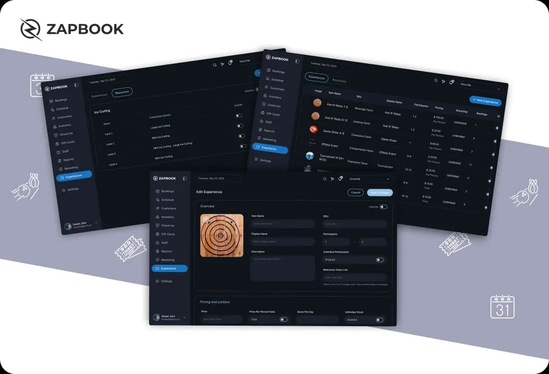
About the project
01 Project overview
Engagement
1.8 months from first audit to system handoff, then a screen-by-screen rollout
Delivery team
SociiLabs' embedded ZapBook team of 4
Core technologies
Figma, Storybook
ZapBook is the booking platform behind curling clubs, bowling centres and activity venues, with five years of features built into one product.
SociiLabs began with a full audit of every screen and every state, as part of the same team behind ZapBook's infrastructure and ZapBot. 1.8 months later, the complete design system was handed off to ZapBook's engineering team as the starting point for new screens.
Today ZapBook builds from one component library in place of three, and feature development takes 35% less time.
02 The challenge
Give a feature-rich product one consistent design language, without slowing the team that keeps shipping features.
01
Five years of features means five years of choices.
Every fast-growing product collects component libraries, framework updates and one-off fixes. ZapBook had three libraries serving different parts of the app. The next step was to bring them into one.
02
Enterprise buyers judge the interface.
Multi-venue operators and investors read product quality from what they see on screen. A button on the booking screen had to look and behave exactly like the same button on the reporting screen.
03
Design and code had to stay in sync.
A Figma file the code doesn't match goes out of date within a quarter. Every design component needed a coded twin with the same states, so designers and developers worked from one source.
04
Feature work couldn't stop.
Venues expect new features every season. The system had to roll out screen by screen while the team kept shipping, with no freeze and no big-bang rewrite.
Why SociiLabs
Designers and engineers who already knew the product.
ZapBook needed a partner who could design the system and also get it into production code. The Figma library was only part of the job. Our scope also covered a full interface audit, design tokens, a Storybook library with matching states, visual regression tests and the rollout plan. Because SociiLabs also rebuilt ZapBook's infrastructure and built ZapBot, we worked inside the same codebase and release process from the first day.
What we built
03 Solution
The design system, and the production pipeline that keeps it honest. One set of tokens drives Figma and code, every component exists in both, and visual tests catch drift before it ships.
Full Interface Audit
We catalogued every screen and every state before changing anything. The audit mapped each variant back to a single target component in the new library.
Design Tokens
One token set defines colour, typography, spacing, radius and elevation. The same tokens compile into Figma styles and CSS variables, so a change lands in both at once.
Figma Component Library
One component library with every variant documented, covering every state from loading and empty to error and disabled.
Storybook Library
Each Figma component has a coded twin in Storybook with the same states. Every component is testable in isolation.
Visual Regression Tests
Snapshot tests on every pull request catch unintended visual changes. A component that drifts from its approved snapshot can't merge unnoticed.
Usage Documentation
Spacing rules, layout patterns and do/don't examples live beside each component, so new developers build consistent screens from their first week.
Architecture
System diagram
INSIDE A PRODUCT THAT KEEPS SHIPPING
One source for design. One source for code. Tests between them.
Design tokens are the single source for every colour, type size and spacing value, in Figma and in code. Each library component is versioned, and breaking changes are announced with a migration note before release. Visual regression snapshots run on every pull request and block merges that change a component unexpectedly. Screens move to the library one at a time, so venues don't see a half-finished interface. Accessibility checks for contrast and keyboard focus run as part of the same pipeline.
Delivery timeline
1.8 months to a complete system. Then the rollout, screen by screen.
The audit came first. The complete design system was handed off 1.8 months later, then rolled out screen by screen as the starting point for new work.
WEEK 1
Interface Audit
Catalogue every screen and every state.
BEFORE HANDOFF
Tokens + Figma Library
Shared tokens and the full component set in Figma.
1.8 MONTHS
System Handoff
Storybook twins, docs and tests delivered.
AFTER HANDOFF
Library Default
New screens start from the library.
ONGOING
Screen-by-Screen Rollout
Screens move over one at a time; feature development time down 35%.
HOW IT STAYED CONSISTENT
Every component exists twice, and both match.
DESIGN–CODE PARITY
Figma and Storybook stay in step.
Each component ships in both places with the same name, states and tokens. A change to a token updates the Figma styles and the CSS variables together.
VISUAL SAFETY
Snapshots guard every merge.
Visual regression tests compare each component against its approved snapshot on every pull request. Unexpected changes block the merge until a designer approves them.
ADOPTION
The library is the easiest path.
Documented patterns, ready-made layouts and clear examples make the library faster to use than writing new styles. That makes the consistent choice the quickest one for every developer.
VISUAL REGRESSION SNAPSHOTS RUN ON
Every PR
TOKEN SOURCE FOR FIGMA STYLES AND CSS VARIABLES
1
LIBRARIES EVERY COMPONENT SHIPS IN, WITH MATCHING STATES
2
04 Impact & results
Impact & Results
One library. Faster features. One design language, screen by screen.
- 3 component libraries unified into 1, covering the operator dashboard and public booking flows, with every screen and state audited first.
- 35% less feature development time once new screens started from tested, documented components instead of fresh styles.
- 1.8 months from first audit to full system handoff, with a screen-by-screen rollout plan that needed no feature freeze.
- Every design component has a coded twin in Storybook with the same states, so designers and developers build from one source. The 35% covers feature development time only; consistency and quality gains are described here, not scored.
- The shared library is the starting point for new screens, and visual regression checks guard every component on every pull request.
- Stronger investor feedback on product quality, now that the dashboard and booking flows look and behave as one product.
Component libraries unified into one system
3 → 1
Less feature development time
35%
From audit to system handoff
1.8 mo
Your product roadmap is waiting on engineering. We ship it.
SociiLabs has shipped 10 projects in 2025–2026 and is rated 5.0 on Clutch. Senior engineers, fixed-scope sprints, and your repo, your cloud, your IP from the first commit.
Book a discovery call